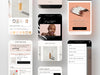
Fenty Beauty

مكياج للجميع للتسلية.
Praella Shopify Plus Agency - Fenty model

الملخص

التحدي

صفحة المنتج 

بدأت شركة برايلا العمل مع Fenty Beauty عندما قرر فريقهم تحسين تجربة المستخدم على الموقع. كان هدف Fenty هو رفع مستوى متجرهم الإلكتروني وعلامتهم التجارية.

لذلك، تم طلب تحديث تجربة التسوق وصفحات المنتجات لتكون أكثر مباشرة وجذباً للانتباه، مع خلق أجواء أنيقة ونظيفة وبسيطة.

كانت إحدى التحديات هي مسألة اختيار الظل. تفخر Fenty Beauty بتلبية كل ألوان البشرة ولديها أكثر من 60 لوناً متاحاً، لذا احتاجوا إلى حل مثالي لاختيار الظل لعملائهم المحبوبين.

تغيير إضافي كان يجب القيام به هو خيار البيع الإضافي. تحديد احتياجات العملاء واقتراح المنتج المناسب لخياراتهم.

تخصيص عربة الدفع

من أجل تقديم أفضل ما لديهم لعملائهم، طلب فريق فنتي حلاً مخصصًا يبسّط عملية الدفع لعملائهم.

بهذه الطريقة، لن يضطر عملاؤهم إلى بدء عملية التسوق من جديد ويتركوا دون إكمال طلبهم.

قسم العمل الخيري

كعلامة تجارية واعية ملتزمة بالشمولية، كانت Fenty قد أنشأت بالفعل منظمة غير ربحية لدعم الأطفال في جميع أنحاء العالم. لذلك، كان من المنطقي فقط أن يدرجوا قسم التبرع على موقعهم لدعم مهمتهم. من خلال القيام بذلك، تُظهر Fenty التزامها بإحداث تأثير إيجابي في حياة الأطفال في كل مكان.

التنقل

من أجل ضمان حصول عملائهم على أفضل تجربة سلسة ممكنة، طلب فريق Fenty تحديثات على قائمة التنقل في صفحاتهم. كانوا قد نفذوا بالفعل تطبيقاً مخصصاً، لكنهم أدركوا الحاجة إلى وظائف إضافية للتطبيق. اتخذوا المبادرة لإجراء التحديثات اللازمة لضمان حصول عملائهم على أفضل تجربة ممكنة.

الحل

Product page

Under the guidance of the Fenty team, our developers started mapping out a better product page layout for the Fenty beauty customers. 

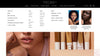
Considering the wide shade range the brand offers for its customers, our team came up with a custom solution that would make the shade selection easy for the customers and the merchants as well, as Fenty continued to expand its range. This solution made the process of shade matching easier and faster for the customers, improving their shopping experience.

In addition to the upsell functionality, our team added a “recently viewed” section to the page, allowing customers to return to the item they might have wanted easily, but were unsure of buying.

Our team also improved the visitor experience by rearranging the design elements and placing them in the most suitable areas of the page, resulting in a more appealing website design overall.

Customization of the checkout Cart

In order to provide a better checkout experience for the Fenty customers, our team rearranged the layout of the checkout cart and added all the necessary fields on the same window. This way, their customers could quickly fill out their information and the preferred shipping method without restarting their shopping process, which would shorten the time needed to complete the order, and directly influence the cart abandonment rate.

Charity Section

Our team developed a custom solution to support the Charity segment of the website, which included an option for customers to donate checkout if they wished to contribute to the foundation. This feature gives customers an easy and convenient way to show their support for the cause.

Navigation

In order to ensure their customers have the most seamless experience possible, our team made necessary updates to their page navigational menu. We improved their mega navigational menu allowing the customers to find what they wanted easily and improving their overall shopping experiences in the store. 

Expand
Praella Shopify Plus Agency - Fenty Beauty website mockup
كيف ساعدنا

' صفحة المنتج حلاً مخصصاً

حل مخصص لتسهيل اختيار الظلال للعملاء والتجار على حد سواء مع استمرار فنتي في توسيع مجموعة منتجاتها. هذا الحل قام بتبسيط عملية مطابقة الظلال، مما جعلها أسرع وأكثر ملاءمة للعملاء، مما عزز تجربتهم في التسوق.

قائمة مميزة CRO

قائمة تنقل ضخمة محسّنة تتيح للعملاء العثور على ما يريدون بسهولة، مما يحسن من تجربتهم العامة أثناء التسوق في المتجر.

browser-window-outlined
Praella Shopify Plus Agency - Fenty Beauty website menu
Next Case
G-Form G-Form G-Form G-Form G-Form G-Form
Praella Shopify Plus Agency - G-form bike